

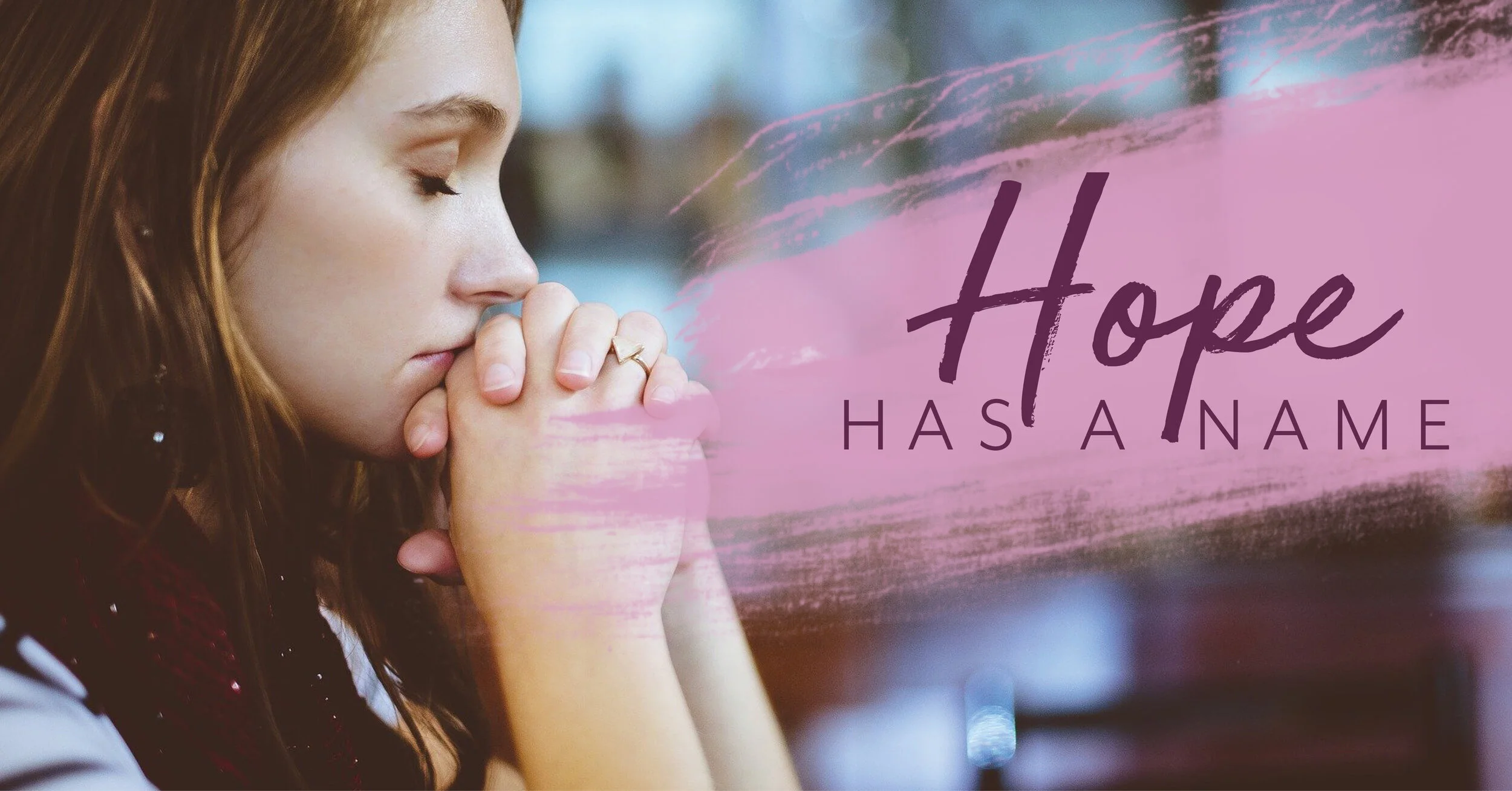
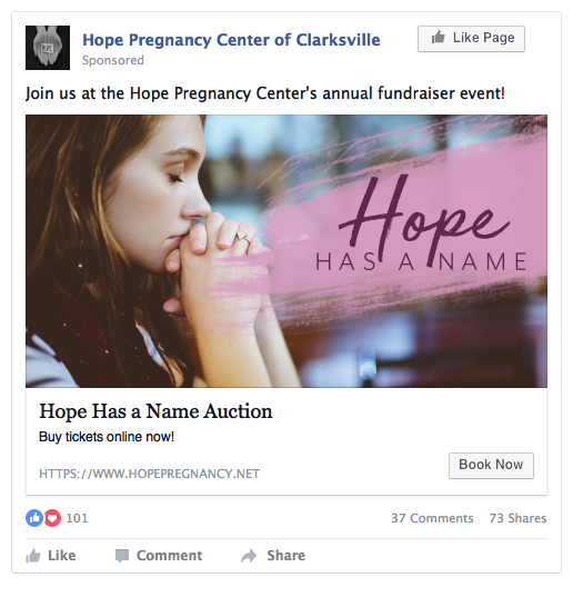
Fall 2020 Client: Hope Pregnancy Center of Clarksville
This was a collaboration with a 4 other designers to produce an event branding for the Hope Pregnancy Center’s upcoming fundraiser in Clarksville, TN.


June 2020 Client: Thirty-One, Social Media Posts
This company wanted social media posts for Facebook and Instagram. They wanted clean and fresh ideas that showcase their bags and bubbly products. Also, Thirty-One wanted a payment card that lays out all the options for their consumers.


August 2020 Client: Iron Dimension, Logo Design
This was for a company out of Nashville, TN called Iron Dimension. They wanted a clean, modern and bold logo and typeface design and paring.
August 2020 Client: Wright Brothers Enterprises, Logo Design
Wright Brothers Enterprises is a company in Kentucky that works to place and repair power lines. They wanted a bold but structured logo, with a typeface that would be easy to read for many heights.
January 2021 Client: MD Farms, Logo Design
MD Farms is a company in Nashville, TN that wanted a stamp-like logo for their brand and packaging. Color scheme was only green and black and a bold typeface.
